Mashups
Creating the Intelligence Room
Over the past few months I’ve been steadily involved with a project that aims to recreate an war/control/intelligence room that you see in movies. The one difference is that the room is ment for decision-makers within bigger companies. Often, urgent en relevant questions go unanswered, but the Intelligence Room helps fixing this.
During the Big Improvement Day we showcased our concept and I’ve created a little Django app that matches all attendees based on topics they provided when signing up for the event.
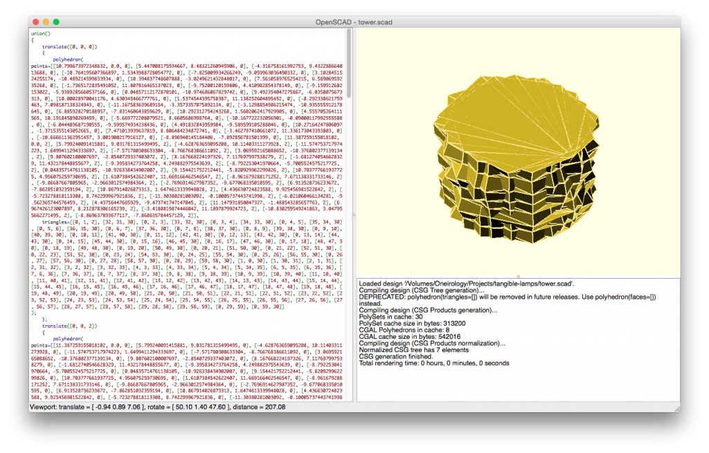
3D printing lampshades or any object based on data.
Last week I stayed at Herman’s place for a couple of days. While there we primarily discussed buttons, 3D printers and other nerdy stuff. As it happend I’d look over on his desk and found some test prints for lampshades made of ABS. That got me thinking.. Just a few hours later I was knees deep in code trying to generate something that would look like a 3D model: 
The curious corner on video
I’ve curated 6 editions of the Curious Corner of the Internet until this day. It started out as an experiment of just showing my saved-for-later links in a presentation. The newsletter essentially was a second format, and I didn’t explore my chances for a talk much further. Until now, during the Week for the Entrepreneur in the Netherlands, that I’d give it another shot. Sadly, it’s in dutch, but here’s the video:
Generating Mondrian like art with D3 & Javascript
SETUP is holding a competition to get programming known as modern day craftwork. I whole-fully agree to this and decided to enter the contest!
With a small part of my time spend while traveling I and finally finishing up I’ve gotten my last version up and running. I use javascript and D3 (SVG) for drawing the elements as this is a library that I wanted to explore. The ease of use and adoption rate of it made a good starting point for me to quickly get to a result.
Datavisualisatie voor het CBS
Het CBS organiseert de eerste seminar over interactieve data visualisaties op 3 februari in Den Haag. Voor de seminar is een wedstrijd gemaakt en ik had een vrije middag over om er mee aan de slag te gaan.
Nadat ik alle drie de data-sets heb bekeken leek het mij het beste om de derde (Landbouw; economische omvang naar omvangsklasse, hoofdbedrijfstype & regio) aan de slag te gaan. Nadat ik de data had gedownload heb ik eerst Google Refine gebruikt om de data schoon te maken en te filteren.
Going interactive!
Some of you may have noticed it already, but from now on, I’m available as freelancer! I’ve made the last step towards it two weeks ago and I’m now registered at the Chamber of Commerce. Most of the projects are covered with this. And one of them is an interactive showcase for the Freemote festival in Utrecht in the beginning of December.
Together with my brother we are building a hybrid manifestation of visualizing brainwaves and other personal metrics.
Infographic van OV-chipkaart data
Ik heb al eerder met de export data van de OV-chipkaart iets gemaakt. Vroeger kon je de locaties van alle stations (inclusief steden en straten) exporteren. Tegenwoordig kan dat niet meer, dus werkte mijn gebouwde app niet meer. De kaart bevat echter teveel waardevolle data die als die op de juiste manier kan worden gerepresenteerd voor inzicht kan zorgen in je gebruik:
Heb jij een idee op welke dagen je het meeste reist?
Measuring mouse interaction
I am an avid user of shortcuts and like to improve my workflow and I would like to discover hidden patterns. This is what happens next. When I bought my Mac 2 months ago I dumped my mouse in favor of the trackpad. Did this influence my mouse/trackpad interaction? Sadly I can’t draw any conclusions about it because I switched my operating system too!
However more recently I started using MacLogger and together with Jelle I’ve made some custom python and processing scripts that should offer more insight into my mouse usage.
Dabblings in Processing
The collected data of 2010, mostly trough PersonalStats, but Foursquare and Twitter too, is a huge amount. Next to interpreting this data and using the information to create a feedback moment, the data can also turned into art. Nicholas Felton makes a perfect example: his highly interesting Annual Report fascinates me in both visual and informational ways.
As Kees discovered Processing, it left me wondering what I could do with it.
RadBox for the iPad
I use Read It Later for saving webpages, but if those pages contained video’s I had to visit the webpages, load the video etcetera… It simply does not fulfill my needs for watching video…
While searching Google I discovered RadBox, which does exactly what I want: use a bookmarklet to save video’s to watch later. They offered an API and RSS-feed of my video’s so I decided to build my own based on App Engine.